Introduction to Color
Why people are confused
There's hardly an everyday subject about which people have more confusion
and mis-information than color. Even professional scientists are
often — perhaps I should even say “usually” —
confused about color.
The main cause of this widespread confusion is the misinformation we're
all fed in grade school. But that really only pushes the question back a
step: why are schoolteachers so confused about color?
Complexity
I think there are two reasons. One is that color is by no means as simple
a subject as it appears. For example, there are two kinds of color mixing
(additive and subtractive). Worse yet, our earliest experiences with
color usually are concerned with common technologies like paints or
watercolors or crayons; but these media involve a complex mixture of both
additive and subtractive color mixing. So our everyday experiences with
color can't be analyzed in a simple way. No wonder we're misled by it.
Terminology
The second problem — related to the first — is that
our everyday vocabulary of color names is both inadequate and ambiguous.
For example, it fails to allow for the three different dimensions of color:
we just have a number of named categories
(like red, green, blue, purple, white, black, brown, …) that
involve
different dimensions of color, without distinguishing
between them. So we need to have names for the dimensions of color space
before we can discuss colors sensibly.
Worse yet, discussions of color are often confined to two-dimensional
surfaces: the pages of books, school blackboards, computer screens. That
makes it even harder to think of color as three-dimensional, because one
of the three dimensions has to be suppressed to fit on the two-dimensional
surface we're looking at.
Three dimensions
So let's adopt some terms to describe the three aspects or dimensions of
color, right here:
- Hue :
- Hue is the quality that distinguishes
red ,
green ,
blue ,
and so on.
- Saturation:
- Saturation is the quality that distinguishes
red, pink, and gray of the same hue and brightness.
Here's a picture of a pink wedge to illustrate
this point:
 Saturation is sometimes described as the
“colorfulness” of a color —
i.e., how much it differs from gray.
Saturation is sometimes described as the
“colorfulness” of a color —
i.e., how much it differs from gray.
Saturation corresponds to what's called
chroma in the
Munsell system for denoting surface colors.
- Brightness:
- Brightness is the quality that distinguishes
white, gray, and black.
Sometimes the word lightness is used
for something like this. (Unfortunately, both words
are sometimes also used to imply saturation.)
Brightness corresponds to what's called
value in the Munsell system.
Continuity
Common usage misleads us in another way. Lots of color names refer
to particular objects or materials: orange, lime, indigo and violet,
for example. Having a modest number of distinct, named color categories
— associated with distinct crayons or paints or objects from our
earliest experience — distracts our attention from the fact that
color space is continuous : there is a smooth progression
of hues from reds through oranges and yellows, and so on. But our words
(as well as our teachers) mislead us into thinking there are just a few
“colors” that are somehow distinct.
This confusion is compounded by teachers' insistence on three
“primary” colors — usually incorrectly chosen as red,
yellow, and blue — which doesn't really agree with everyday experience.
What we do experience in everyday life is the existence of six
unique colors that define the ends of three directions in color space: the
complementary hue pairs red and green, and blue and yellow;
and the unique ends of the
brightness dimension, namely white and black.
Ambiguous usage
Another semantic difficulty is that the word “color” is used in
conflicting ways in English. Sometimes we use it to describe all possible
parts of color space; but in common usage, “color” usually refers
to just one aspect of color, namely, hue (which is what distinguishes
red from blue and green and yellow).
This conflicting usage of the word color leads to fruitless
arguments about whether black and white are colors.
More confusion is caused by failure to distinguish between color
and other aspects of appearance, like luster,
texture , and transparency .
That leads people to think there are colors named “silver” and
“gold”, when these terms really refer to a white or yellow
color combined with
metallic luster (i.e., strong specular reflection).
Still more confusion follows from a failure to distinguish between
the physical stimuli that elicit sensations of color, and the sensations
themselves. We're accustomed to attribute colors to objects, rather than
our responses to them: a blue book, a red chair, and so on. This sloppy
habit is reinforced by the phenomenon of “color constancy”: the
perception of nearly the same color in an object, even when seen under a
variety of different illuminations (daylight, twilight, artificial light,
… ) that produce very different physical stimuli.
Finally, color is so important in so many fields that conflicting
terminology has grown up in different areas: art, photography, color
printing, television, and so on. So each field has its own set of words
to describe the dimensions of color; even experts who understand color
have difficulty understanding one another.
Common misconceptions: Primary colors
If you were taught in school that the three primary colors are red,
yellow, and blue, forget it. That's wrong.
Color space is 3-dimensional, all right. But before we can talk about
primary colors, we need to ask what we want that term to mean.
Usually, the idea is that there are 3 colors that can be “mixed”
together to form others. But there are different ways to mix colors.
Additive primaries
What your computer screen does is to add together the light from three
different kinds of phosphor (or other light sources). Here they are,
one by one:
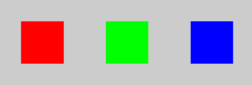
When we add them in pairs we get this:
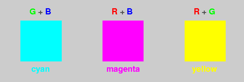
The bright, sky-like blue made by adding the green and dark-blue
primaries is called “cyan” in the color business.
Red added to blue light makes magenta, a more familiar color. And —
surprisingly, to many people — red light added to green light makes
yellow.
And all 3 together make the white background behind this text:
White = Red + Green + Blue
Subtractive primaries
But if you take pieces of colored glass or plastic, each colored piece
removes some colors from white light. For example, a
red filter absorbs blue and green, leaving only red. A green filter
removes red and blue; and so on. Obviously, if we stack up a red
filter and a green filter, the red one removes the green light, and
the green one removes the red light, and they both remove blue light;
so we're left with no light at all (assuming the filters are perfect).
In subtractive color mixing, red + green = black. So the additive
primaries aren't useful for subtractive color mixing.
To make subtractive primaries, we need filters that only take out
(i.e., subtract)
one of the additive primaries at a time, leaving the other two.
So if we start with white light (all 3 additive primaries together) and:
- Remove red:
-
White − Red =
(Red + Green + Blue) − Red =
(Green + Blue)
And of course we saw that's called “cyan”, up
above. So cyan is “minus red”.
- Remove green:
-
White − Green =
(Red + Green + Blue) − Green =
(Red + Blue)
And red plus blue is magenta; so magenta is
“minus green”.
- Remove blue:
-
White − Blue =
(Red + Green + Blue) − Blue =
(Red + Green)
So that's yellow, or “minus blue”.
So the subtractive primaries are cyan, magenta, and yellow.
Now, how do these subtractive primaries combine? Suppose we take cyan and
magenta filters and superimpose them. The cyan takes out the red; the
magenta takes out the green; what's left is the blue-violet — the
“blue” additive primary.
Similarly, yellow plus magenta leaves red; and yellow plus cyan leaves
green. The subtractive primaries, paired up, produce the additive
primaries.
Cyan, magenta, and yellow
are the (transparent) inks you'll find in a color printer. Color
printing with inks that filter out colors is subtractive color mixing;
the inks act like filters.
Complementary colors
You probably noticed that for every additive primary, there's a
corresponding subtractive primary formed by removing that additive
primary from white. For example, yellow is (minus blue); so blue and
yellow are complementary colors. The other complementary primary pairs
are green and magenta, and red and cyan.
Notice that white can be produced by adding two complementary
colors. In fact, this is really the basis of the idea of complements:
any two colors that can be added (in the proper proportions)
to give white are complements. They don't need to be primaries.
Mixing paints
Now, what happens when we mix paints instead of inks?
Mixing paints certainly isn't additive; if it were, you could mix red and
green paint to get yellow, as we did above with the computer screen.
But as everyone knows, red and green paint mixed produce a muddy brown.
That's not too far from the black we'd expect from subtractive mixing.
But paints aren't exactly subtractive, either. When you stack filters,
you get the same transmission regardless of the order in which the light
goes through them. But
if you paint one color on top of another, you see mostly the top color.
Paints contain little particles of colored pigment. The little bits of
pigment absorb some light and transmit some light, but they also scatter
some light. So paints aren't either purely additive or purely
subtractive; the two kinds of color mixing are combined in a complicated
way. But usually the subtractive part dominates the mixture. (Crayon
colors do much the same sort of thing.)
Notice that cyan is somewhat like a light blue; so if you ignore the
difference between red and magenta, the subtractive primaries might almost be
called “red, yellow, and blue”. This is where the story that red,
yellow and blue are primary colors of paint came from.
But, if you've ever mixed paints, you know this isn't the true story.
About the only part of the schoolroom story that works is mixing blue and
yellow to get green; and that works, because what's touted as
“blue” in school paints or crayons is usually a greenish blue,
close to cyan. And, subtractively, cyan plus yellow (which removes the
blue-violet part) leaves green.
The situation is complicated by the fact that the pigments available to
produce colored paints are far from ideal. They don't remove just one
additive color, but take out some of each. Usually, the absorption is
strongest in the blue and violet, so subtractive combinations end up being
a very dark yellow or orange.
Brown
But what's a dark yellow or orange? Here you see them:
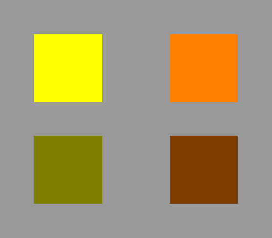 The yellow square, like the one shown at the left, was generated in PostScript
by telling the computer to display both the red and green phosphors at
maximum intensity. The orange square to its right was made by asking for
full Red intensity and half Green.
The yellow square, like the one shown at the left, was generated in PostScript
by telling the computer to display both the red and green phosphors at
maximum intensity. The orange square to its right was made by asking for
full Red intensity and half Green.
The two squares below were produced just by asking for half as much of
everything. You can see that the darker yellow appears olive green, and
the darker orange, brown. The names “yellow”
and “orange” are used only
for colors of those hues with high brightness. Darker colors of the same
hue and saturation are called “olive” and “brown”.
Incidentally, what the human visual system considers “light”
or “dark” depends very strongly on the perceived context.
If I had displayed the orange square here against a white background instead
of a medium-gray one, you'd have perceived it as brown rather than orange.
There are some vivid demonstrations of this context effect at
Edward Adelson's checker-shadow illusion,
and the paper
by R. Beau Lotto and Dale Purves,
“An empirical explanation of color contrast”
(Pub. National Acad. Sci. 97, 12834–12839 (2000),
which you can download as a PDF file if your institution subscribes to
PNAS.
The most striking demonstration, by Al Seckel at Caltech, is currently
off-line.
Purple
The color that was called “magenta” above is an example of a
class of non-spectral colors called purple.
(The term “non-spectral” means that these colors do not appear
in a spectrum.)
The purples are complementary to various shades of green.
Colors of the rainbow
Rainbows
are natural spectra — although they're relatively insipid ones,
compared to what can be seen in an optics laboratory, or even displayed on a
computer monitor.
What's important here is that “all the colors of the rainbow”
does not include all the colors: the purples are missing. And of course
the dark colors, like brown and olive, aren't in rainbows, either.
Where to learn more
There's a great set of Web pages on color at
http://www.handprint.com/,
starting with the page on
color vision.
This material is all written from the point of view of a user of
watercolors, so it should be easy reading for anyone who has passed
through grade school.
There is, however, a lot of stuff there. Take your time and read through
it. You'll find it quite worth while.
For people who have a professional interest in color, Charles Poynton's
COLOR FAQ
has become a standard reference on the Web.
I've also made an old tutorial article on color for technical readers
available here. It explains how to calculate the
color of an object if you know its reflectance spectrum.
Copyright © 2005 – 2012, 2021 Andrew T. Young
Back to the . . .
GF reading page
or the
GF pictures page
or the
GF home page
or the
website overview page