One of the most difficult tasks in displaying colored images is to render spectra even approximately correctly. The problem is not only that the fully-saturated colors of the spectrum cannot be exactly reproduced in any medium but monochromatic light itself; there is also the problem of mapping the spectral hues into the chosen display medium.
People who are unfamiliar with color science often suppose that one could just take a color photograph, and then reproduce that. But color photography, while it renders many common objects reasonably well, is dismal at capturing spectra.
Instead, one can do better with a wholly synthetic approach: generate the image entirely in digital form from scratch. But even this method has difficulties. It's particularly difficult to do a decent job on a Web page, where you have no control over the adjustment of the viewer's own monitor. Different monitors use different technology (consider CRT vs. flat-panel displays, phosphors vs. plasma displays, etc.), so that different devices have different “red”, “green” and “blue” primaries; and there are the brightness and contrast adjustments as well.
Fortunately, most monitors these days are fairly similar, which has led to the creation of a standard for these displays, the “sRGB” idealized monitor. This standard has been adopted by the World Wide Web Consortium. Since the creation of this standard, manufacturers have tried to make their displays closer to it, so one can hope that most viewers will see roughly similar images in browser windows these days.
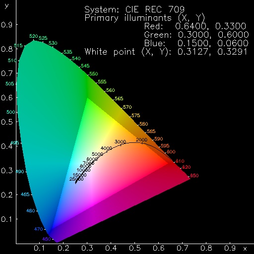
The picture at the right shows where the sRGB monitor primaries fall in the CIE chromaticity diagram. Colors outside the Maxwell additive color-mixing triangle, whose corners represent these primaries, cannot be reproduced on the monitor. As you can see, that includes all the pure spectral colors (arranged around the horseshoe-shaped upper boundary of the colored area.) Even colors considerably less saturated than those in real green flashes cannot be reproduced correctly on the monitor (i.e., those in the shaded area outside the Maxwell triangle); only colors inside the triangle lie within the gamut that can be reproduced on the monitor.
There is a standard procedure for converting a color of known chromaticity into the RGB signals used by the standard sRGB monitor, which is intended to reproduce the color correctly. (The original sRGB website has disappeared, but the basic information is archived on the Wayback Machine, which you might like to consult these days.) Basically, this consists of (a) transforming the spectrum locus from CIE to RGB phosphor primaries, and then (b) correcting the RGB signals individually for the nonlinearity of the display.
The first problem arises when trying to do the conversion. The spectral colors are far outside the gamut of colors that can be reproduced with the standard phosphors. This means that the linear transformation from CIE to RGB primaries produces not only values greater than unity (i.e., phosphor signals greater than 100% of full scale), but negative values as well.
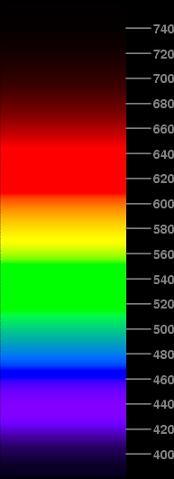
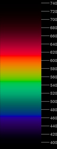
The standard prescription is to truncate values greater than unity to be 1.000 exactly, and to set negative values to zero. The image at the left shows what happens when you do that; the nominal wavelengths, in nanometers, are marked on the scale along the right side of the spectrum.
You can see that there are several problems. First, there are regions, particularly in the green and red hues, where a considerable range of wavelengths is represented by the same saturated signal. Everything from 462 to 466 nm is solid B, with no G or R; everything from 515 to 552 nm is solid G; and everything from 609 to 644 nm is solid R. So these pieces of the simulated spectrum come out a uniform color, while a real spectrum shows a continuous variation of color throughout.
Second, the short-wavelength region below about 450 nm that ought to appear “violet” actually comes out more purple than it should. Besides, this region looks brighter than the pure-blue section above it, though it ought to look darker; this is a result of the red added to the blue to make the purple part (the red phosphor has much higher visual brightness than the blue one). Clearly, there's too much red in this part of the image.
Third, other hues aren't quite right. That big stretch of green in the middle ought to be closer to the “unique green”, which is neither bluish nor yellowish. Instead, it's just the color of the green phosphor, which is on the yellowish side of unique green, at least in the sRGB monitor (and indeed in most CRT displays). The red end of the spectrum is the color of just the red phosphor, which is a little more orange (i.e., yellowish) than the actual long-wavelength end of a real spectrum. And I think the yellow region is too wide.
Evidently, these defects are largely the result of excessive truncation at unity and zero after transforming from CIE's XYZ to RGB space. Certainly the solid patches of red, green, and blue are a result of that “clipping” effect. So let's try to reduce it.
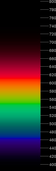
We can reduce the truncations by reducing the size of the signal demanded from the display. As a first stab at this, I tried reducing the luminosity (the CIE “Y” value) by a factor of 2.
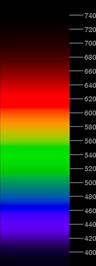
The image at the right shows the effect of this reduction. The saturated regions are almost gone now; only a little bit survives in the red, which now extends from 609 to 623 nm. There's now a continuous change of color through most of the spectrum.
Unfortunately, we still have some problems. The middle greens are still represented by pure green phosphor, though with varying intensity. The reds are still pure red phosphor. The violet region is still too red and too bright. And, because of the reduced brightness, the yellow region has practically vanished.
There are some subtler problems — not so obvious to the eye, but the numerical values in the PostScript file from which this JPEG image was created reveal them. For example, the brightest part of this spectrum is in the green at 539 nm; but it ought to be at 555, where the CIE visibility function peaks. Evidently, we still have some truncation problems.
What we really need to do is bring the spectral chromaticities — which are all outside the gamut that can be reproduced with the sRGB phosphors — back to the edge of the realizable gamut. If you picture this in the CIE (x,y) chromaticity diagram, the problem is that a point outside the physically realizable gamut always involves a negative value of R, G, or B (in linear intensity space, before gamma correction).
For example, in the overly-red short-wavelength region, the spectral hues lie below the B primary, and indeed below the line joining the B and R primaries. That means the linear transformation has to ask for a negative amount of the G primary. But, because the G primary lies far to the right (larger x value) of the B primary, subtracting some G from B moves the sum of the B and G terms to the left of B; so the linear transformation also has to ask for a large amount of R to move the resulting sum back to the right again.
What we need to do in this region is shrink the point representing a violet hue back to the line joining the B and R primaries, adding just enough R to get the hue right, even though the resulting point is farther from the lower left corner of the spectrum locus in the CIE diagram.
As a rough approximation, we can assume the constant-hue lines are lines of constant dominant wavelength, and project each spectrum-locus point back to the sRGB gamut boundary. (This isn't quite right, because of the Abney and Bezold-Brücke effects — which we shall ignore for the moment.) Fortunately, John Walker has provided a C program to do this, at http://www.fourmilab.ch/documents/specrend/. Here's how it works:
First, note that the white point of the monitor corresponds to (R, G, B) = (1, 1, 1). Then, if the value of some requested component — G, for example — is negative, we can bring the point back from the spectrum locus to the BR edge of the gamut triangle by multiplying its offset from the white point by 1/(1 − G). (As G is assumed to be negative here, the denominator of the fraction is bigger than unity, so the fraction is less than unity.)
Actually, we want to preserve relative brightnesses; so instead of moving toward white, we need to shrink the out-of-range vector toward the gray point with the same brightness, Y, as the point in the spectrum we are simulating. That means that the correction factor is Y/(Y − G). Call this correction factor F; then the corrected G intensities are
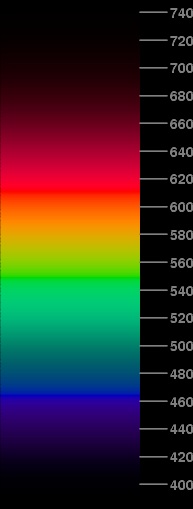
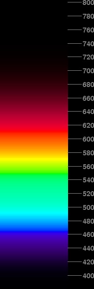
Here's the result of doing that. The short-wavelength end of the spectrum now looks much more realistic: the hues are really violet, rather than purple; the brightnesses are down where they ought to be, darker than the blue section. There are also improvements in the blue-green region, where the transition to green is more gradual, and the yellow-orange region, which is slightly broader than before. The red end now looks really red, not orangish-red.
We still have minor problems. The red phosphor is saturated from 590 to 616 nm. And of course, we still are using only half intensity, so there's no clear yellow.
The saturation of R in the red region indicates that we are still trying to make the spectrum brighter than its best possible approximation. The problem there is that the R phosphor isn't bright enough by itself to represent the full brightness required by the standard visibility curve around 600 nm. (In the yellow-green region, the requested brightness is made up by the addition of the very bright G phosphor.)
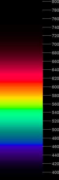
The only way to solve this saturation problem is to darken the whole spectrum still further. But it turns out that not much is needed: instead of dividing the V(λ) values by 2.0, just divide them by 2.34.
The spectrum at the left shows the result. This isn't much darker than the previous approximation, but the “flat spot” is gone from the red around 600 nm.
By the way, both this and the previous spectrum have the property that all wavelengths shorter than 464.3 nm (the dominant wavelength of the B phosphor) and longer than 611.3 nm (the dominant wavelength of the R phosphor) are portrayed as mixtures of R and B. The dominant wavelength of the G phosphor is 549.1 nm; so, as you'd expect, the yellower greens are mixtures of G and R, while the bluer greens are mixtures of G and B.
This is as faithful a representation of a spectrum as standard monitors allow us to display. But what spectrum is it? As the brightness levels correspond to the CIE luminous efficiency function (sometimes called “luminosity” — a term that has quite a different meaning in astronomy), this is roughly what you'd see if you were looking at a spectrum that had equal energy in every wavelength interval. That is, the power per unit wavelength is constant.
However, what an electrical engineer would consider a “flat” or “white” spectrum would have constant power per unit frequency . The spectrum below on the right shows what that would look like.
This doesn't look very different from the constant-power-per-unit-wavelength spectrum. The red end is a little dimmer, and the violet end is brighter here, but the two spectra look remarkably similar.
To make this, I've simply scaled the intensities at each point by dividing by the current wavelength squared . [Those who remember their calculus will recall that changing the independent variable of a distribution introduces a factor of the ratio of the differentials of the two variables; as frequency is the reciprocal of wavelength, the differential of frequency is proportional to 1/(wavelength)2. For further information on this relationship, see
B. H. Soffer, D. K. Lynchwhere the importance of including the Jacobian in the transformation is discussed.]
Some paradoxes, errors, and resolutions concerning the spectral optimization of human vision
American Journal of Physics 67, 946–953 (1999)
Of course, the Sun's spectrum isn't “flat” in either sense; it has still a different distribution of energy. However, it's now clear how one might represent the solar spectrum. You could use the method given here to select the sRGB intensity ratio for every wavelength, and then scale everything to match the actual distribution of energy in the Sun's spectrum. (But even that wouldn't be what you'd see on pointing a spectroscope at the Sun, because it omits the effects of the Earth's atmosphere.)
In doing this, it would be best to save all the numerical values as intensities, and then scale them so as to make the display as bright as possible without getting into the saturation problem. Maximum brightness has the advantages of making the ends more visible, as well as turning the muddy-looking region around 580 nm from olive to yellow.
The same scaling trick could be employed to produce reasonable-looking simulations of emission-line spectra: scale the visually brightest line to just saturate its brighter phosphor. (Remember that every color on the gamut boundary is represented by just two of the three phosphors.)
Speaking of maximum brightness, a very showy (if somewhat artificial) spectrum can be made by forcing all the colors in the middle to be represented by something as bright as possible. That is, instead of sticking to the V(λ) curve, let's make every color between the dominant wavelengths of the B and R phosphors have its greater phosphor intensity scaled to unity. This displays more or less the correct hue at every wavelength, but in a way that ignores much of the decrease in visual sensitivity away from the yellow-green region. (It also ignores the difficulties with phosphor brightnesses that caused the saturation problem in the red, above.)
The spectrum at the left shows the result. It's pretty garish, and certainly not natural-looking. I've normalized the pieces at the end to taper off according to the V(λ) curve, but scaled to join the artificially bright part in the middle smoothly.
In principle, it would be possible to extend this same maximum-brightness trick into the UV and IR; but as the ends of the visible spectrum show no appreciable hue change, that would be rather uninteresting and even more artificial-looking, I think. So it probably looks better to taper off the ends according to V(λ), adjusting each end to join the maximum intensities at 464.3 and 611.3 nm (the dominant wavelengths of the pure Blue and Red phosphors), as is done here.
Now that we see the effect of various operations, let's try to come up with a best compromise between brightness and accuracy. We had to reduce the brightness to get the correct relative brightnesses; but this turned the yellows into olives. We can increase the brightness a bit, which gets the yellows back again, but then some colors in the red-orange region (and perhaps elsewhere, depending on the amount of brightening) cannot be represented in their proper brightness.
Suppose we try this, keeping the colors on the gamut boundary and reducing all the intensity components equally to keep the maximum value at 1.0 for any single phosphor when the correct intensity scaling would call for more than full brightness from any phosphor.
If the brightness is increased too much, the effect of clipping the effective V values to keep the right hue without exceeding any single phosphor's maximum brightness will produce an un-natural appearance. If it's increased too little, the yellow region of the spectrum doesn't look right. I've experimented with various brightness increases, and found that factors between 1.8 and 1.9 seem to produce the best results. The spectrum at the right shows the compromise I've adopted, with intensities increased by a factor of 1.85 (at most — less in places to avoid saturation or hue distortion).
This spectrum doesn't look too artificial, even though the variations in brightness with wavelength do produce some slight indications of artificial intensity maxima where they shouldn't be. I think this is about as good a representation of the appearance of a real spectrum as can be obtained on a computer monitor.
But if you try printing this page on your inkjet or color laser printer, you'll be disappointed. The colors come out very muddy-looking; the hues are wrong in some places; and none of my carefully tweaked spectra looks good. What's wrong?
First, these devices use a subtractive set of primaries (CMYK) instead of the additive RGB primaries of a monitor. Although the printing software in your system tries to convert from RGB space to CMYK space, the conversion is imperfect — not least, because the computer doesn't know exactly what inks or dyes the printer has in it.
Second, the saturation of colors that can be displayed on a monitor usually exceeds the saturation that can be printed on paper, particularly at high brightness. In this respect, color printing resembles color photographs (which are also produced by a subtractive process): to get saturated colors, you have to do a lot of subtracting of the parts of the spectrum you don't want; and that subtracts a lot of the brightness. So printed colors that are light always come out as pale pastels.
Worst of all, most color printing isn't purely subtractive. The halftone screens used in 4-color process printing are really a mixture of additive and subtractive color; but even inkjet and laser printers have some contamination of this sort. And that means that the actual colors that appear on the paper depend on nasty uncontrolled variables like the nature of the paper itself: its color, its texture, how much the ink or toner spreads out and soaks in when it hits the paper, etc. All these complexities mean that the color that appears on the paper can't be exactly computed.
Some of these variations can be handled by measuring a color-management profile of your printer, and using color-management software to control what gets printed. And, in a professional pre-press service bureau, all these things get taken care of. But not in the average office, which doesn't have colorimeters and people who know how to use them.
So don't ask if you can have permission to print one of my spectra in your textbook. And don't ask for a copy of my program so you can make pretty pictures for your thesis. (Especially if you don't understand the CIE chromaticity diagram.) It won't do you a bit of good.
Instead, go read my more technical page about color, and the references cited there. Learn something about color science; and then learn something about the technical side of color printing; and, when you've finally learned how to print spectra on paper so they look good, please come back and let me know. I'd like to be able to do it myself.
© 2002 – 2008, 2011, 2012, 2021 Andrew T. Young