Scanning and Laser-Printing 19th-Century Engravings
Introduction
Sometimes I need to reproduce plates or figures from 19th-Century works.
You'd think this would be simple enough: just scan the figure, threshold
the image to make the inked areas come out black and leave the paper
white, and convert the bi-level (monochrome) image to PostScript form for
publication.
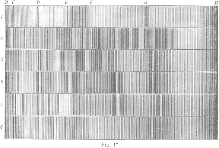
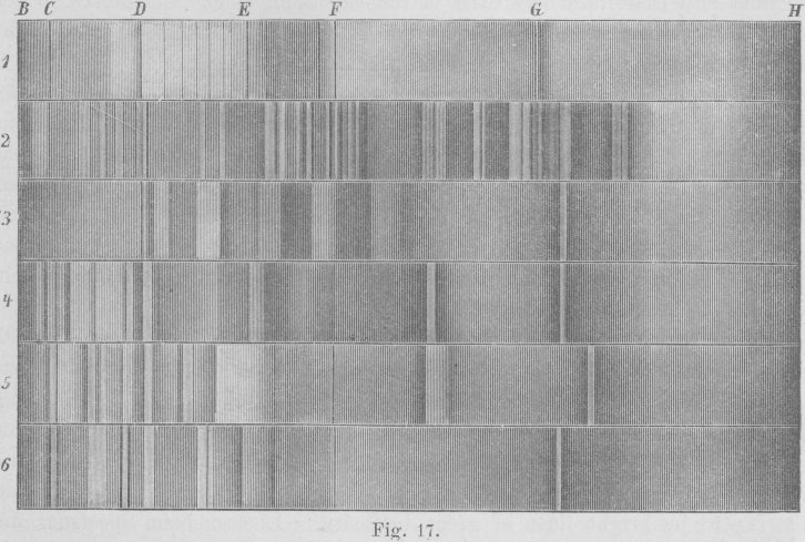 Here's an example. The image at the right was scanned when I wanted to
reproduce the shadings used to depict spectra by means of a wood-engraving
in H. Kayser's Handbuch der Spectroscopie ; I've
reduced the resolution
by a factor of 8 here to make the image fit on the screen.
(This grayscale version looks much like the original printed page.)
Here's an example. The image at the right was scanned when I wanted to
reproduce the shadings used to depict spectra by means of a wood-engraving
in H. Kayser's Handbuch der Spectroscopie ; I've
reduced the resolution
by a factor of 8 here to make the image fit on the screen.
(This grayscale version looks much like the original printed page.)
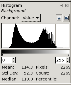
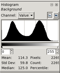
If we look at the histogram of the original (not the reduced!) image, we
get what's shown below at the left. It's not what you'd expect: the
peaks for the black and white pixels are not cleanly separated, but
overlap considerably.
Furthermore, the white pixels seem to fall into two groups, so that the
whole histogram has 3 peaks instead of the expected 2.
(This will be explained later.)
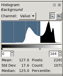 However, there is a fairly well-defined minimum at
about data value 164; so let's threshold the image at that level and see
what we get. (The resulting image follows the next few paragraphs.)
However, there is a fairly well-defined minimum at
about data value 164; so let's threshold the image at that level and see
what we get. (The resulting image follows the next few paragraphs.)
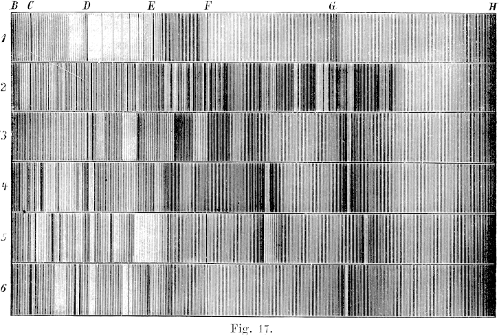
Again, I've
reduced the resolution
of the thresholded image (which
contained only black and white pixels) by a factor of 8; so what's shown
here is a grayscale image. However, it shows the characteristics of the
thresholded full-resolution image fairly well.
The result looks very different from the input image.
The contrast has
been greatly increased: what were dark grays have become nearly black.
In both the lightest and the darkest areas,
the details of the shading have been lost.
(This reduced image also shows some artifacts. The diffuse, nearly
vertical banding that's particularly obvious in the right half of the
image is due to aliasing of the shading lines at the reduced resolution
shown here; you can ignore that.)
 So reproducing a black-and-white print isn't as simple as scanning and
thresholding. To begin with, scanners don't capture an image
perfectly: because of scattered light and optical imperfections in the
imaging, there's a certain amount of
blurring that washes out the finer
details. While this blurring isn't important for some work, it loses
appreciable detail in copperplate engravings, and even in wood engravings.
So reproducing a black-and-white print isn't as simple as scanning and
thresholding. To begin with, scanners don't capture an image
perfectly: because of scattered light and optical imperfections in the
imaging, there's a certain amount of
blurring that washes out the finer
details. While this blurring isn't important for some work, it loses
appreciable detail in copperplate engravings, and even in wood engravings.
As a result, the fine lines used for shading tend to
wash out. In lightly-shaded regions, the shading becomes paler; in
heavily-shaded ones, small ink-free areas darken.
So the light areas become lighter, and dark ones darken: paradoxically,
the blurring increases the apparent contrast of the shaded areas.
In fact, the histogram of such a scanned image often
doesn't have a deep, clean minimum separating “ink” from
“paper” pixels. (It may not even be bimodal.)
This problem is apparent in many published books that attempt to reproduce
engravings. For example, the original frontispiece to Galileo's
“Dialogue Concerning the Two Chief World Systems” (in Stillman
Drake's translation published by the University of California Press in
1962), which appears after the Translator's Preface, is very poorly
reproduced because of these effects: details are lost in both the
highlights and the shadows of the scene. (Though this was produced
photographically in the days before scanners and laser printers, the same
problems occur in photographic imaging.)
Further trouble appears on the output side, if a laser or inkjet
printer is used. The darker areas tend to block up and become solid black,
increasing the contrast still more.
Again, it's a problem with fine detail: even though good laser printers
these days have 1200 or more dpi, they won't cleanly reproduce the delicate
features in engraved shading.
Part of the problem is that scanning and image processing involve
gray-scale or analog images, not binary black and white. The scattering
of light within the paper makes any printed page inherently a grayscale
image, even with perfect scanning and printing. So you need to think in
terms of shades of gray, even though you start with black ink on
(presumably white) paper, and end up with black ink or toner on white
paper again. And the gray scale introduces issues of
gamma and contrast
and other considerations that weren't present
in the original printing plate, and aren't present in the desired result.
Another part of the problem involves the incommensurate resolutions of
scanners and printers. Scanners tend to have resolutions like 800 or 1600
dpi, while laser printers are typically 300, 600, or 1200 dpi. So we need
to worry about aliasing and resolution problems as well.
These pages explain the various parts of the
problem, and describe ways of dealing with them on a Debian Linux system.
Ink on paper isn't black and white
First of all, there's a problem that occurs on both the input (scanner)
and output (printer) sides: ink on paper isn't just black on white.
Paper isn't a uniform white surface, and ink isn't uniformly black.
Under a high-resolution microscope, you see that the paper becomes
darker close to a large inked area. And the thinnest lines in
engravings aren't solid black lines, but fade away gradually into shades
of gray or brown.
The reason for this is that the interaction of light with paper
and ink isn't all or nothing. The fibers of the paper scatter and
redistribute the incident light; when there's a heavily-inked area nearby,
some of the light that would have bounced around inside the paper and
eventually emerged gets absorbed by the neighboring ink instead.
So the apparent
reflectance of the paper diminishes toward the edge of a dense black mark.
(This internal scattering of light within the paper is a problem in
radiative transfer. It's really a three-dimensional process; there is
a one-dimensional simplification, known as Kubelka-Munk theory, but it's
not fully adequate to describe the process.)
The light penetrates a surprising distance into the paper; that's why
things printed on the back of a sheet “show through” on the
front side. Let's suppose the light spreads laterally within the paper by
a distance comparable to the thickness of the page. A typical ream (500
sheets) of paper is about 5 cm (2 inches) thick, so a sheet is about a
hundredth of a centimeter, or a 250th of an inch, thick. So we'll
certainly see this effect in a scan made at 600 or 1200 dpi, or more.
(And the problem occurs again
when the image is printed on a laser printer.)
Likewise, the fine lines of good engravings are so thin that they
don't contain enough ink to be “optically thick”. If you
look at them under a microscope (or at least a high-power magnifier),
you'll see the finest lines are shades of gray or brown, not pure black.
In very thin layers, even black ink isn't completely opaque. So, again,
we have to deal with shades of gray.
Of course, when a scanned image is printed on paper, the light gets to
scatter around
again
within the paper of the reproduced copy,
so we have another round of image blurring due to radiative transfer.
That means that we have to make some allowance for this in printing the
scanned image.
Things are different when we view the scanned image on a computer
screen — an intermediate step we have to make when we process the
image. Again there's scattering of light in the screen; but this time
things are a little different, because we're writing white marks on a dark
background, instead of the other way around. We can minimize the screen
problems by viewing the image at high magnification.
The input side: scanning
But that assumes perfect scanning. Actually, scanners aren't perfect;
they blur the image further,
so that fine details appear less contrasty than they should.
The attenuation of high spatial frequencies in an image
is usually described by a modulation-transfer function (MTF).
If we knew the MTF of a scanner [or,
equivalently, its point-spread function (PSF)], we'd at least have the
information needed to correct the scanned image for blurring by the
scanner. But such information isn't usually available for scanners;
their makers don't even offer typical values. In any case, we should
expect that the actual blurring of a particular scan depends on defocus
and other peculiarities of our particular scanner, and the properties
of the ink and paper used in the original page we're trying to copy.
So even a “typical” PSF or MTF wouldn't be exactly what we need.
That means we have to figure out the blurring of the image from its
internal structure. Fortunately, we know that the original page was
printed so that solid-black areas should be uniformly dark; so we can use
the edges of such areas — if some exist in the original image —
to determine the blurring, and reconstruct an approximation of the
original printing plate.
Even if there isn't a solid black area available, it may still be possible
to infer the blurring by looking at the cross-section of lines of
different widths in the image.
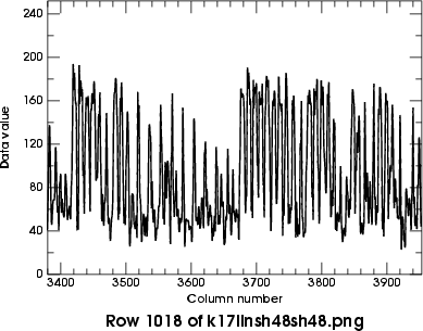
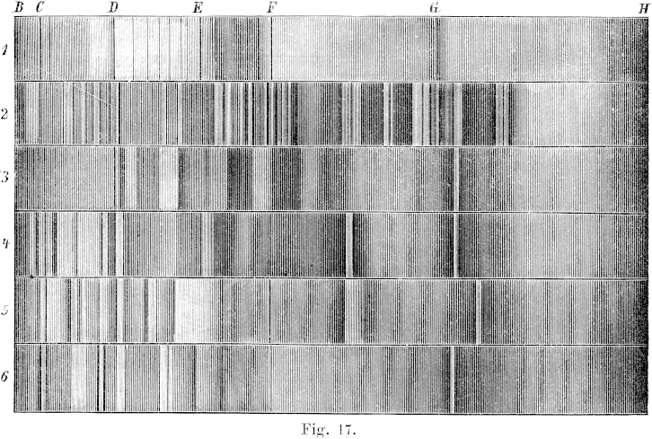
Here's an example. The figure at the right shows the original raw image
at low resolution. On the left below, the grayscale image shows a small
area of the second spectrum (marked “2” at the left side of
the full image),
showing the details of the complex region below the letter G
at the top edge of the full image. Notice how alternating black lines and
white spaces of different widths are used to produce shading.

 Immediately below the image is a plot of the data values along its middle
row. You can see the problem: the black lines around columns
3680–3740 are actually about the same shade of gray (near 150)
as the white lines between the heavy black ones around col. 3650.
(The same problem appears again in the thin white lines near
cols. 3830 and 3930.)
So there's no threshold that cleanly separates white and black.
Immediately below the image is a plot of the data values along its middle
row. You can see the problem: the black lines around columns
3680–3740 are actually about the same shade of gray (near 150)
as the white lines between the heavy black ones around col. 3650.
(The same problem appears again in the thin white lines near
cols. 3830 and 3930.)
So there's no threshold that cleanly separates white and black.
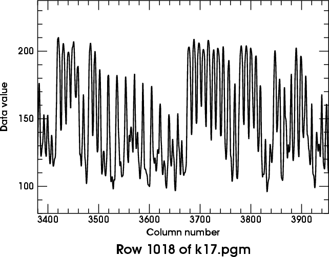
Furthermore, the black and white bars have rounded intensity profiles,
instead of being approximately square on the tops and bottoms, as we should
expect. This is another effect of the blurring in the scanner data.
I discuss blurring at considerable length on
another page.
The parameter adopted there is the period of a sinusoidal component of the
image that's attenuated by a factor of 2 — not an easy value to
extract from real images.
However, there are places where black and white shading bars of about
equal width occur. They usually have periods of about 15 pixels
(in our example image); and these features aren't seriously degraded.
That certainly sets an upper limit to the blur scale.
On the other hand, there are isolated narrow features, typically about
3 pixels wide, that are clearly smeared out quite appreciably (e.g.,
the narrow white spaces between the broad black shading bars around
column 3600 in the rowtrace shown here, and the narrow black lines around
col. 3700). From these, I'd guess that
the blurring length is 5 or 6 pixels.
The
formula
I used for restoring images uses the square of this length R; so I'll try
R2 = 30.
The value of the “sharpness” parameter to be
used in the Gimp's Sharpen filter is then about 41; this filter
is to be applied twice to obtain a reasonably well-corrected image.
(See the
discussion
on the
blurring page
for the details of these calculations.)
To bracket the proper correction, I tried using sharpenings of 35 and 48
as well. The best result seemed to lie near 48; so I then tried
56 as well, to make sure I had gone far enough.
 Here are the resulting histograms of the enhanced images, at full resolution.
The de-blurring was done after converting the original image
to intensity, to avoid the noise-rectification problem described on the
blurring page. The conversion to
intensities made all the images darker, as explained on the
gamma
page; so these histograms aren't directly comparable to the
original
one shown near the top of this page.
Here are the resulting histograms of the enhanced images, at full resolution.
The de-blurring was done after converting the original image
to intensity, to avoid the noise-rectification problem described on the
blurring page. The conversion to
intensities made all the images darker, as explained on the
gamma
page; so these histograms aren't directly comparable to the
original
one shown near the top of this page.
← The first (at the left) was sharpened by 35 twice.
It still has the double peak near the white level; clearly, this
image is under-corrected.
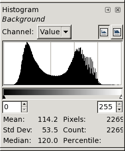
The second version (at the right) was sharpened by 41 twice.
The near-white peaks are now coalescing; clearly, this
version is better. →
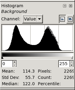 ← The third version, sharpened with 48, is on the left.
This seems a fairly good result; the white peak is becoming
compact. However, the histogram is starting to develop little
“feet” at its extremities, suggesting that we're starting to
amplify the noise excessively.
← The third version, sharpened with 48, is on the left.
This seems a fairly good result; the white peak is becoming
compact. However, the histogram is starting to develop little
“feet” at its extremities, suggesting that we're starting to
amplify the noise excessively.
 Finally, on the right, we have the result of sharpening with 56.
The “feet” are now quite obvious, and the image itself shows
definite “ringing” at the black/white transitions. This is
clearly too much sharpening. →
Finally, on the right, we have the result of sharpening with 56.
The “feet” are now quite obvious, and the image itself shows
definite “ringing” at the black/white transitions. This is
clearly too much sharpening. →
Below are the row plots for the two best versions (sharpenings of 48 and
56, each done twice) in the same region that was shown in detail
above.
You can see that the thin black and white lines that had similar
data values in the original image now have been enhanced enough that
thresholding near a data value of 100 will make them visible.
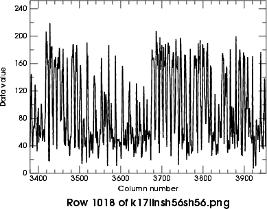 From here on, I'll adopt the version sharpened by 48 twice.
 ← Here is a
(reduced)
version of the sharpened image, thresholded at 100.
Thresholding has produced an image that's black where there was ink on the
original page, and white where there was just paper.
← Here is a
(reduced)
version of the sharpened image, thresholded at 100.
Thresholding has produced an image that's black where there was ink on the
original page, and white where there was just paper.
This version looks better than the one that was just
thresholded
without sharpening; detail has been preserved in both the lightest and
darkest areas, and the overall contrast is now lower (i.e., more like the
original
grayscale image).
(In choosing the final thresholding level, you should allow for the
subsequent lightening that must be made to compensate for the imperfect
blackness of the
ink
on the original printed page. Therefore, pay a little more attention to
preserving detail in the finest lines, and in the lightest shading
rather than the darkest, if a choice has to be made.)
However, the contrast is still much higher than the original —
especially in the darker areas.
That's because (as explained
here)
the inked areas on the original page weren't perfectly black, while
thresholding produces completely black blacks.
The cure for this problem (as explained
here)
is to
add
a little something to the black areas.
Experimentation shows that “something” should be about 50,
for this particular image.
 So here's the result of incrementing the black pixels by 50.
You can see that it's a lot closer to the
original
grayscale image.
So here's the result of incrementing the black pixels by 50.
You can see that it's a lot closer to the
original
grayscale image.
Basically, we've reproduced the original as a bi-level image (white and
dark gray, not white and black).
Notice that we have adjusted the color of the background from
light gray (in the original scan) to white; this, together with the
sharpening, gives this processed version a much cleaner look than the
original.
Now we're ready to print this out.
The output side: laser or ink-jet printing
The basic printing problem is that a laser printer makes much blacker
blacks than the grayed-out ones in the image above. How can we achieve
the desired gray shade on a printer?
There are several standard ways of representing shades of gray in
two-level (black and white) printing.
They all come under the heading of
halftoning.
Although there is a well-developed theory for digital halftoning, it
suffers from the same kind of weakness as
Cassini's refraction theory:
it's an exact solution to an idealized problem that omits essential
details of the real-world problem we actually want to solve.
In halftoning, the missing details have to do with the overlapping circular
dots
that the printer actually places on the paper, where the computer model
has square pixels.
The dots have to be big enough to fill in solid-black areas completely;
this makes them cover more of a gray area than they should, making all the
shades of gray too dark (usually, much too dark.)
In principle, we should really measure the reflectance our printer
produces for each of the 256 possible gray levels, and correct every
grayscale image with the inverse of that function. That's a lot of work!
Fortunately, we don't have to do all that. We carefully reduced our
original image
above
to a bi-level (gray and white) one. So there's only one shade of
gray to be rendered by the printer.
If you download my 255-shades-of-gray
image,
and convert it with the same
halftoning
method you use for printing, all you have to do is print its halftoned version,
and see what input gray value makes your
printer produce the desired shade of gray on paper.
Then, just add that value to the black-and-white (thresholded) version.
Usually, the amount you add will be more than what's needed to make a
correct version on the monitor screen; I added 50
above
to get the right version on the screen, but I need to add about
140 to get a version that prints properly on an HP 2420 (1200-dpi) laser
printer.
You might need to adjust the value to be added until you get what you
want. But basically, this should do the trick.
Just remember: the gray-level adjustment depends on the printer you use,
the paper you print on, what toner or ink cartridge you use, etc.;
so every combination requires its own offset.
Copyright © 2006 – 2009, 2012 Andrew T. Young
Back to the . . .
main LaTeX page
or the
GF home page
or the
website overview page